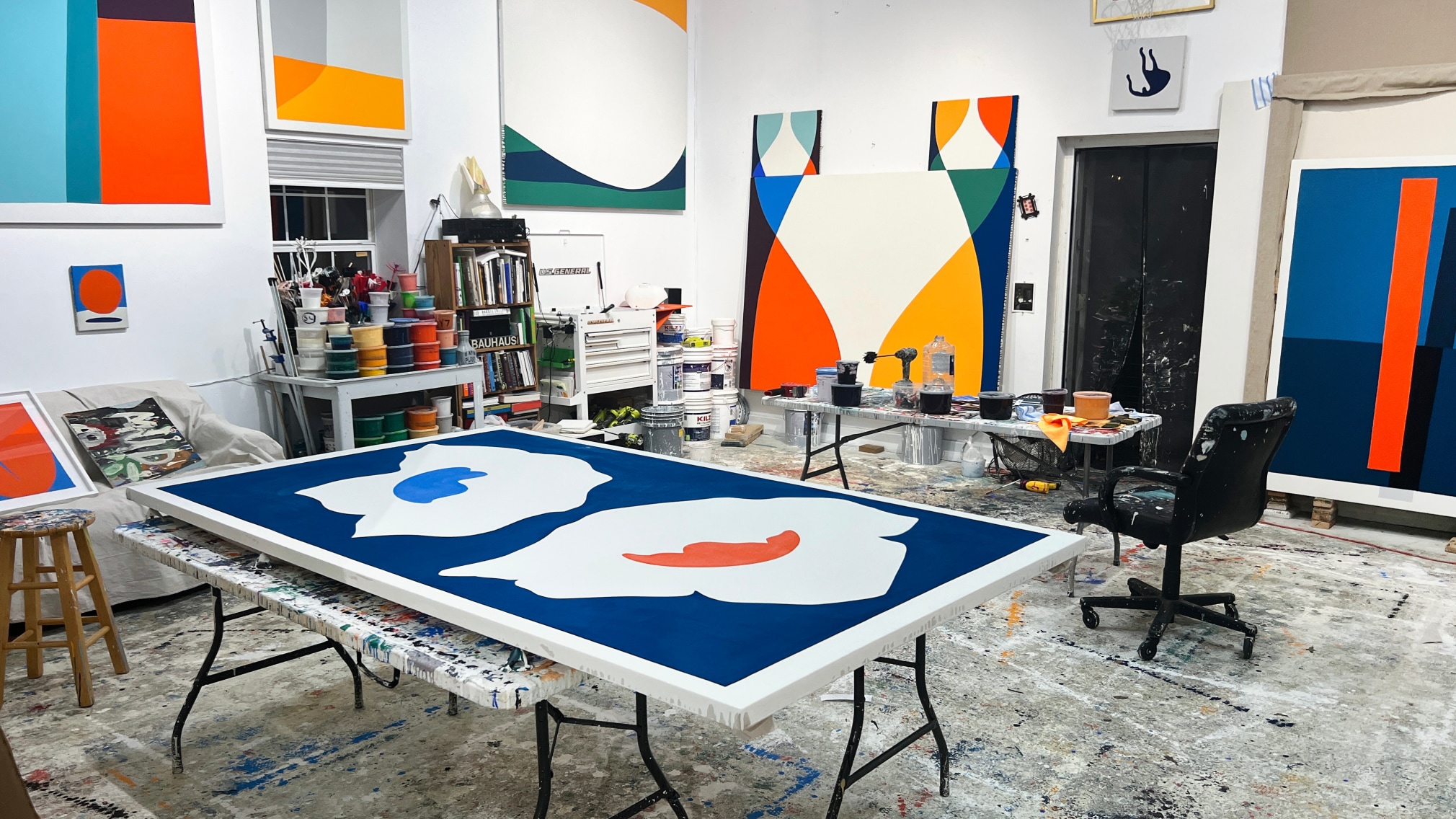
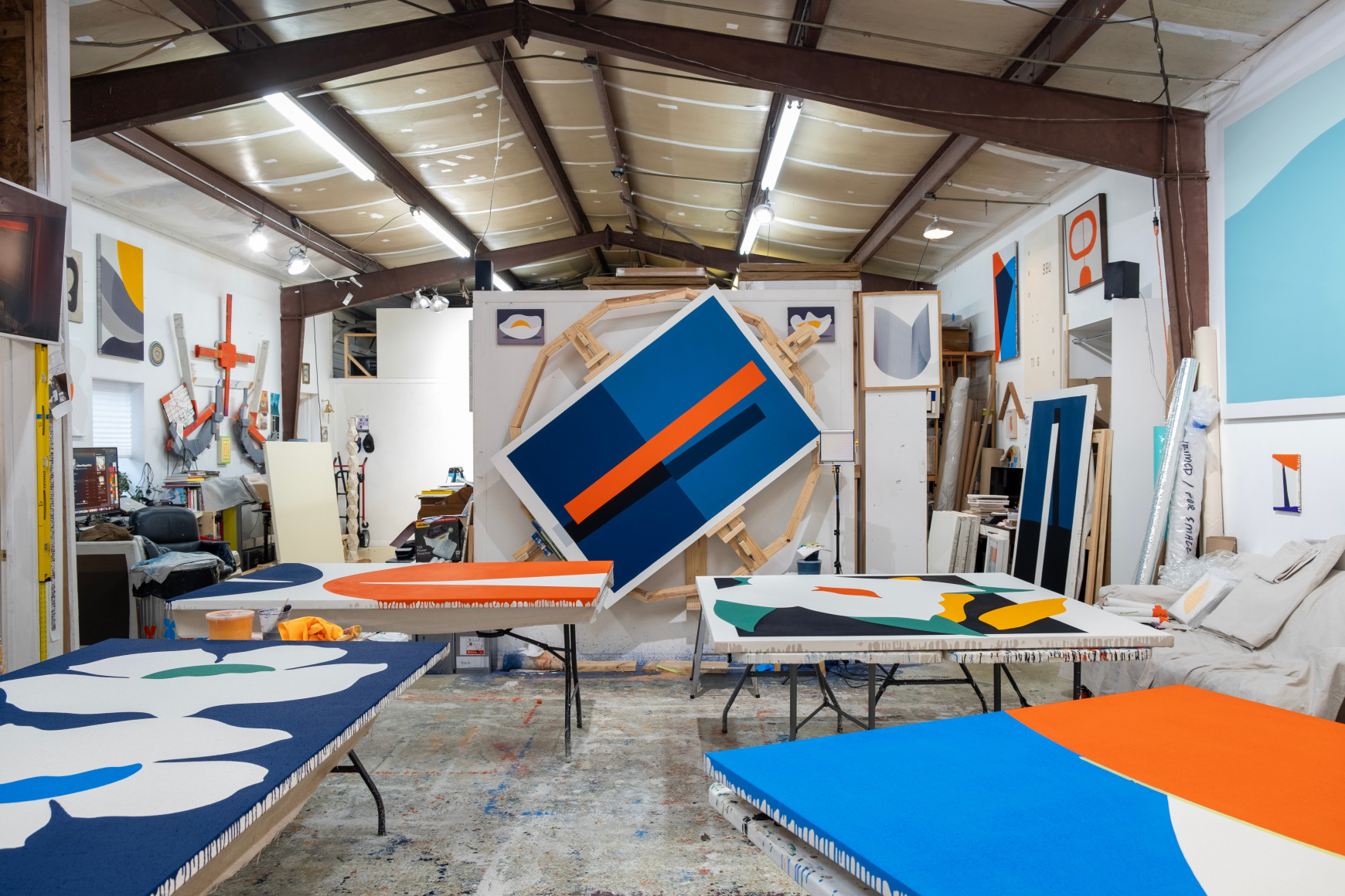
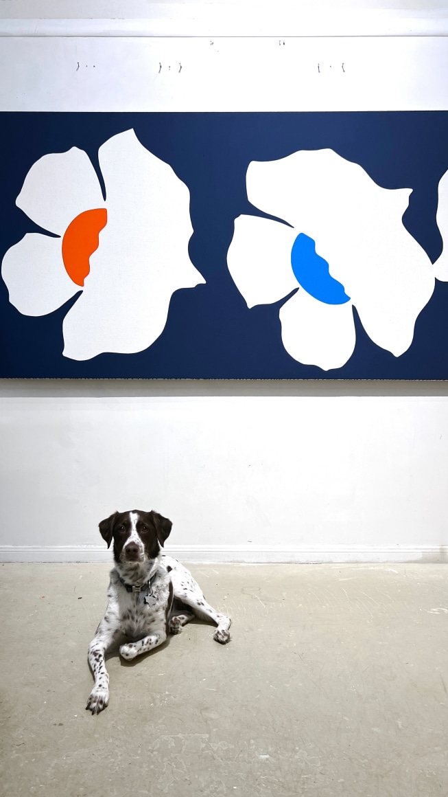
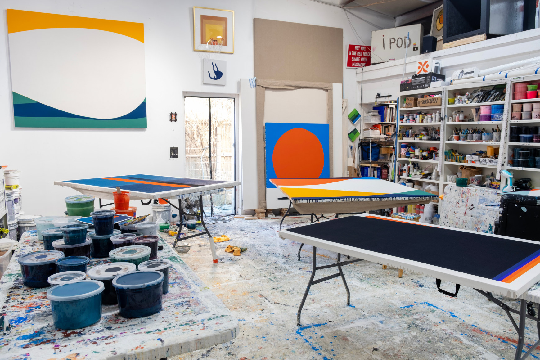
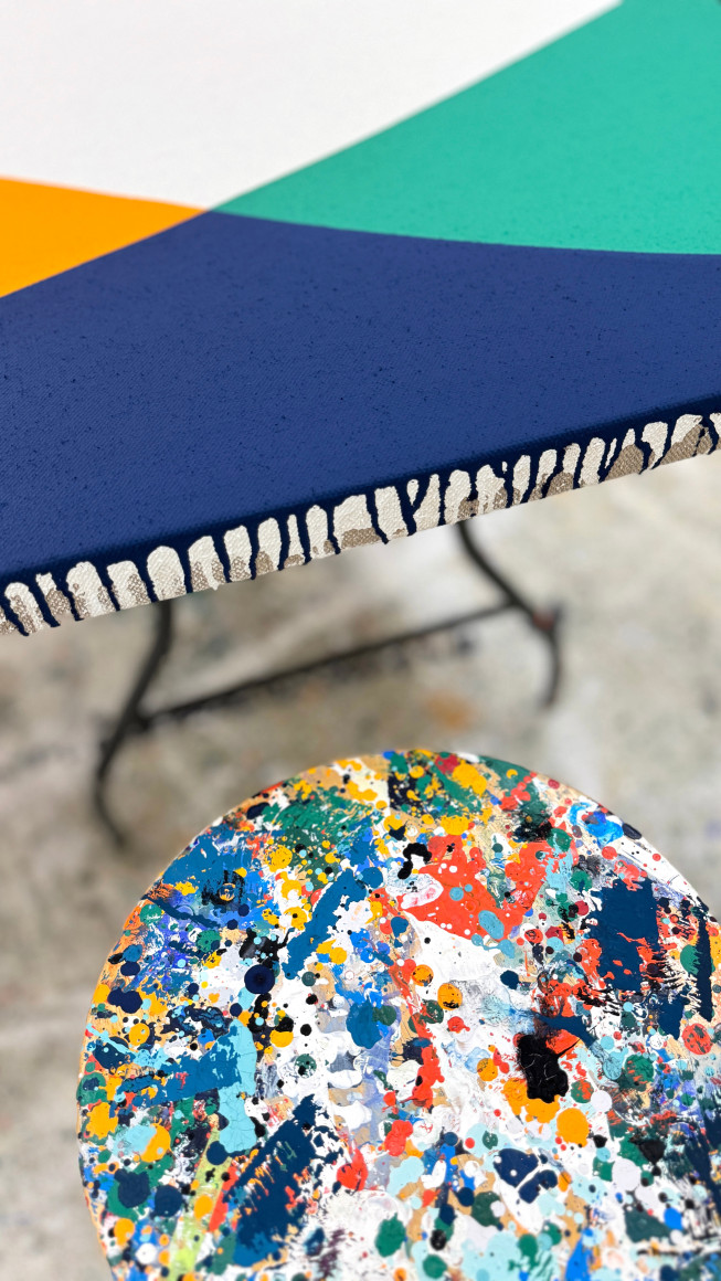
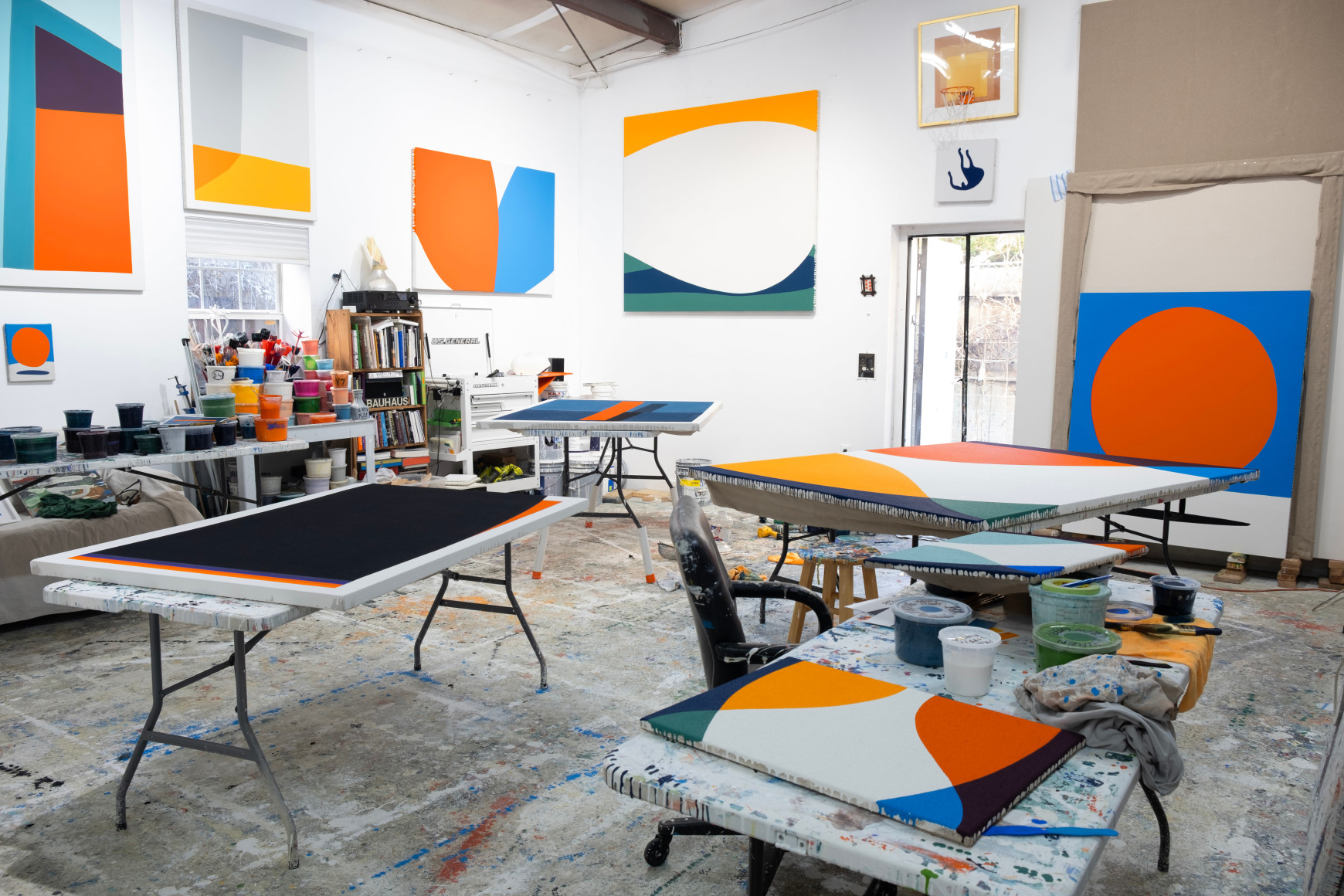
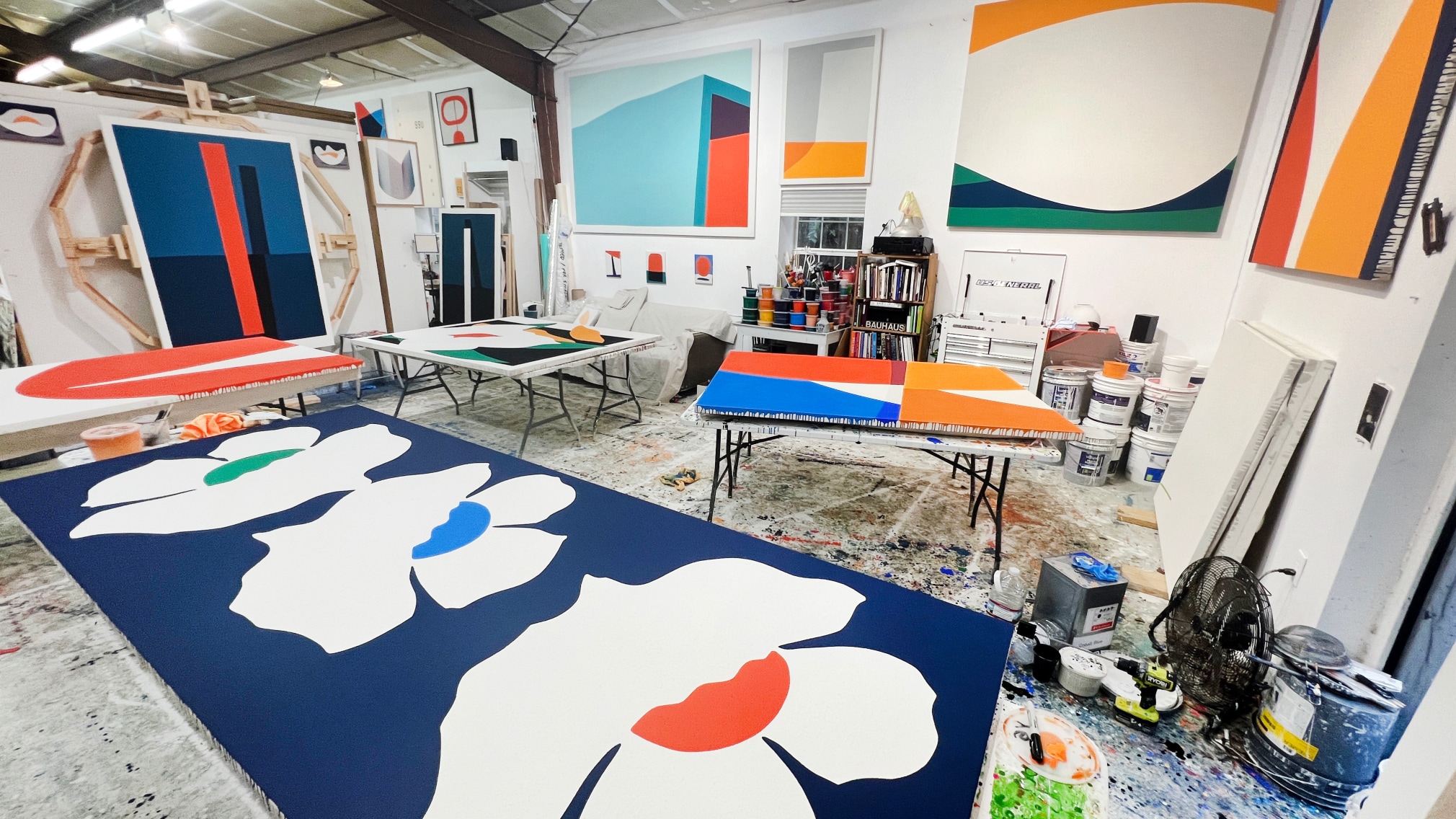
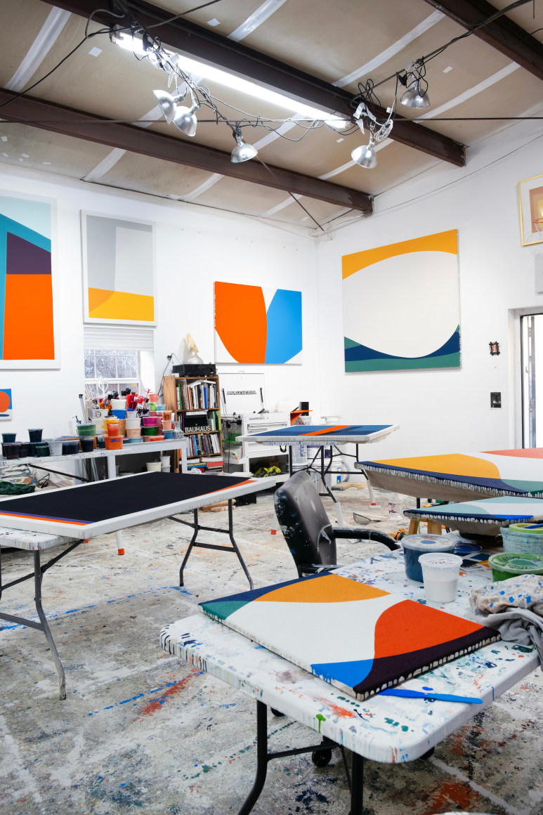
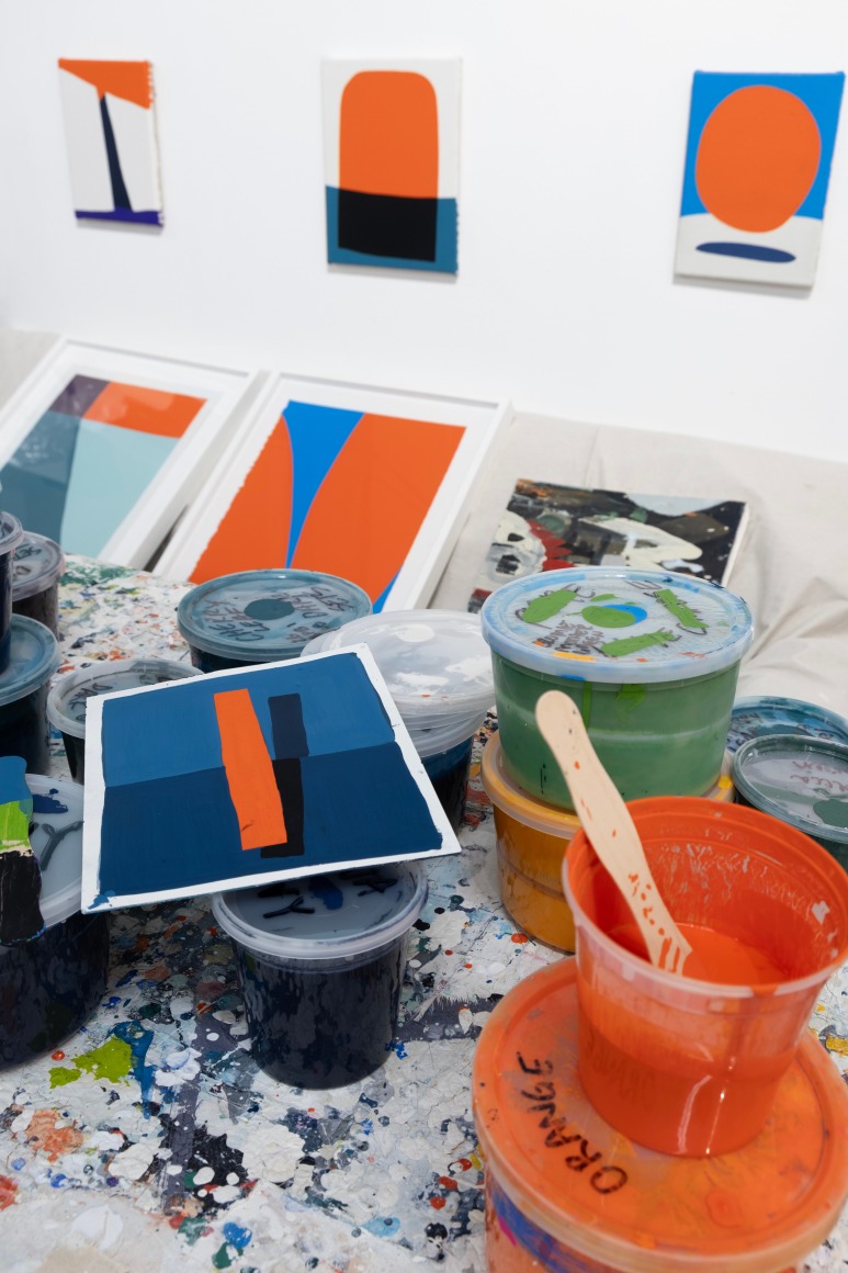
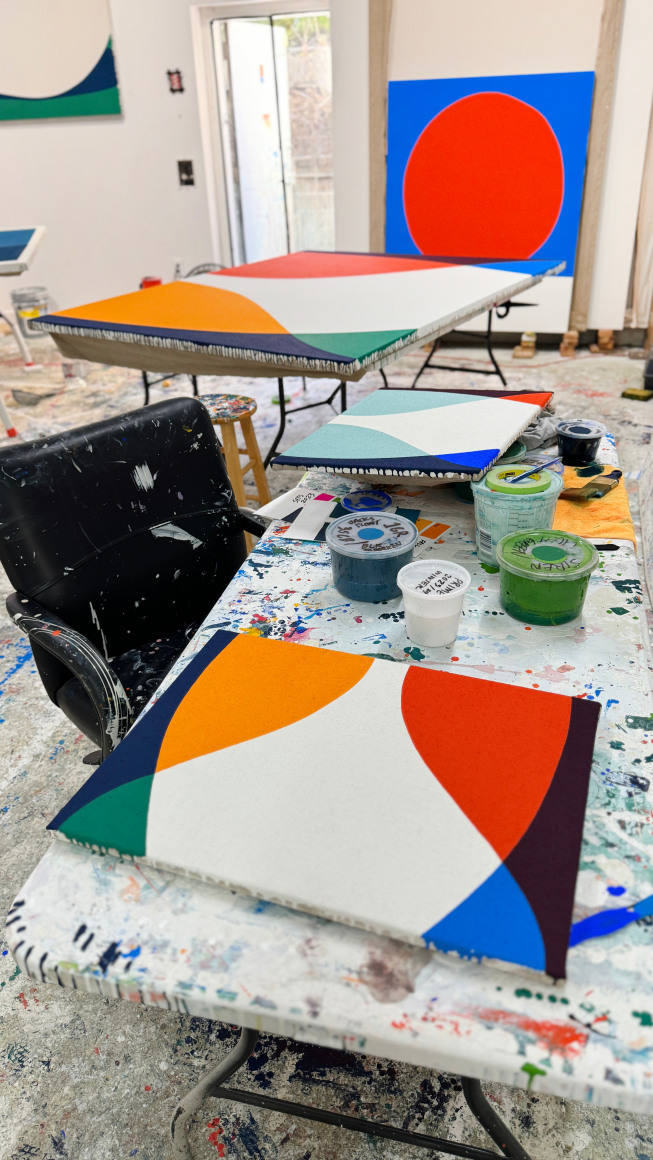
Paul Kremer's studio.
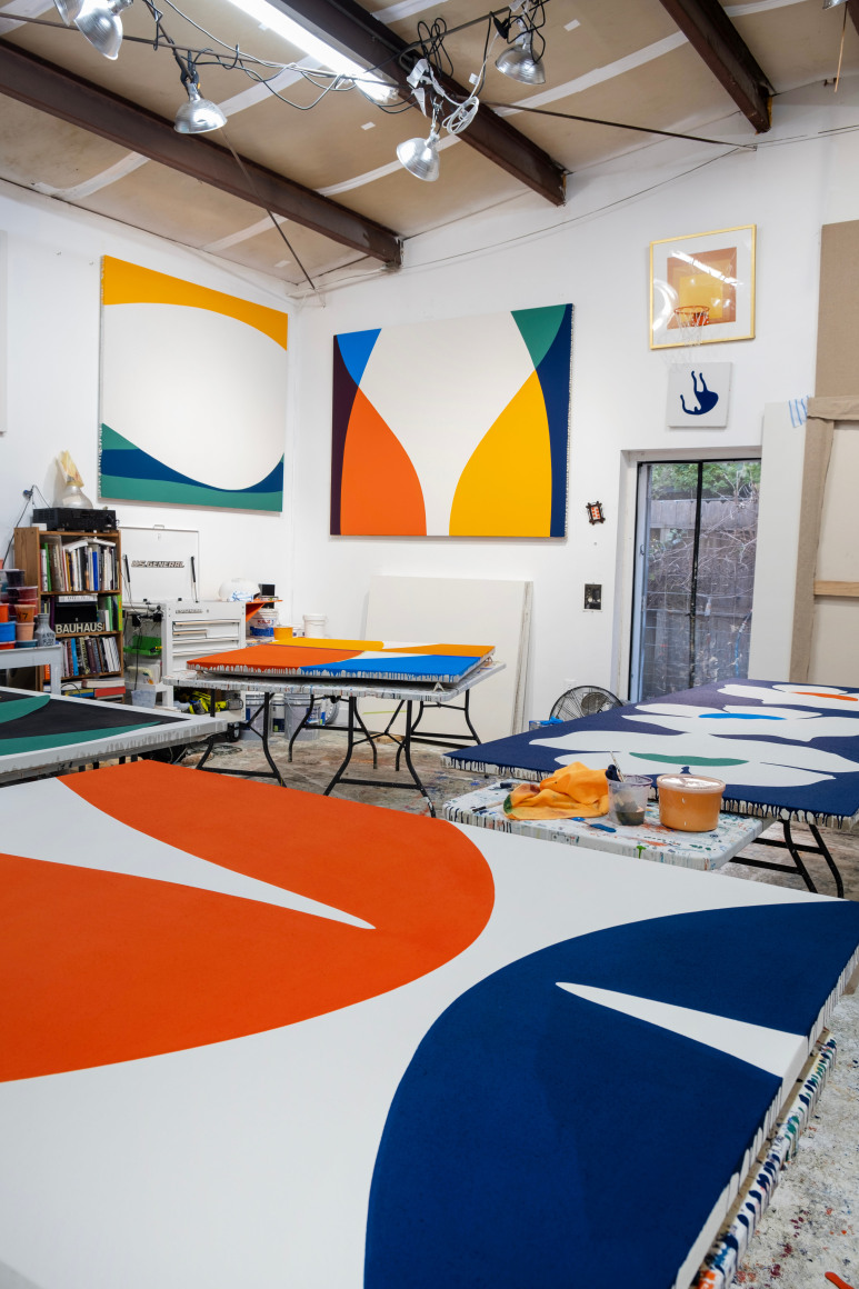
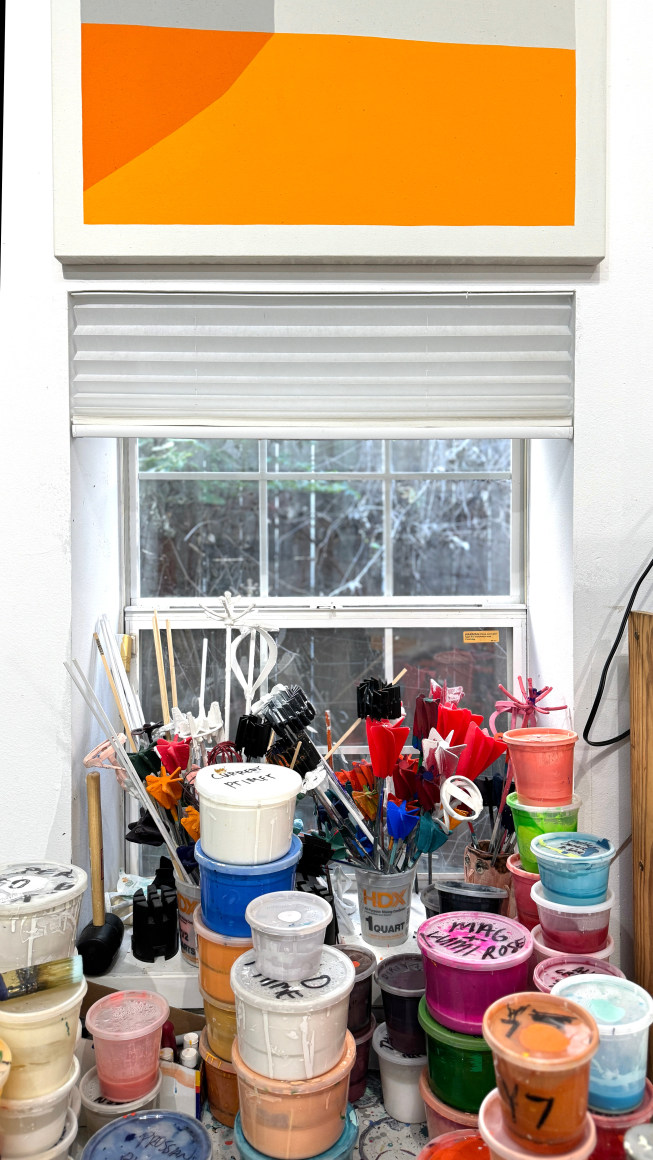
Paul Kremer's studio.
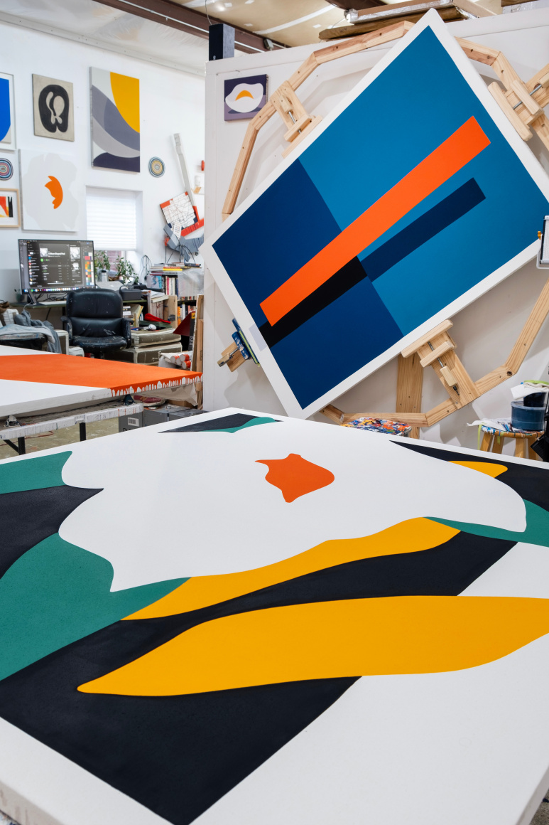
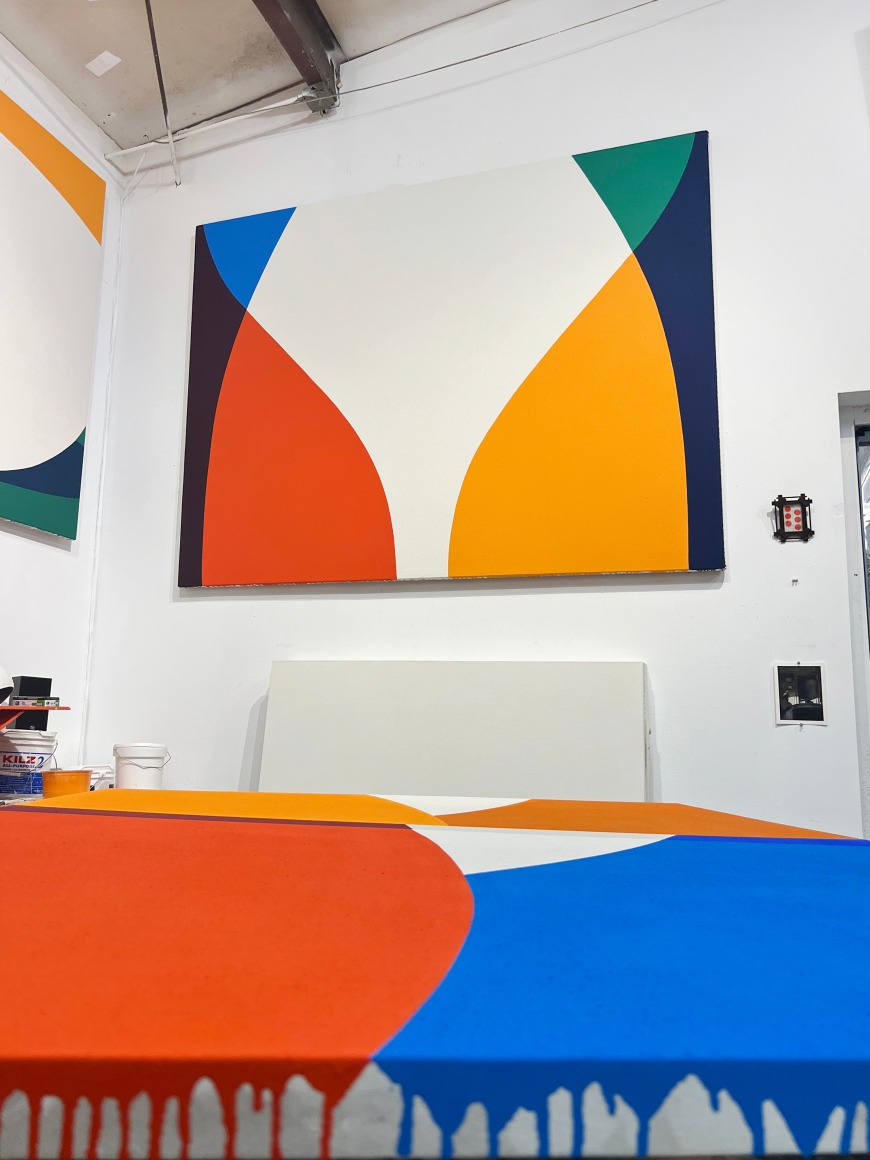
Paul Kremer's studio.
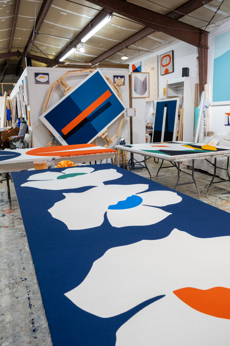
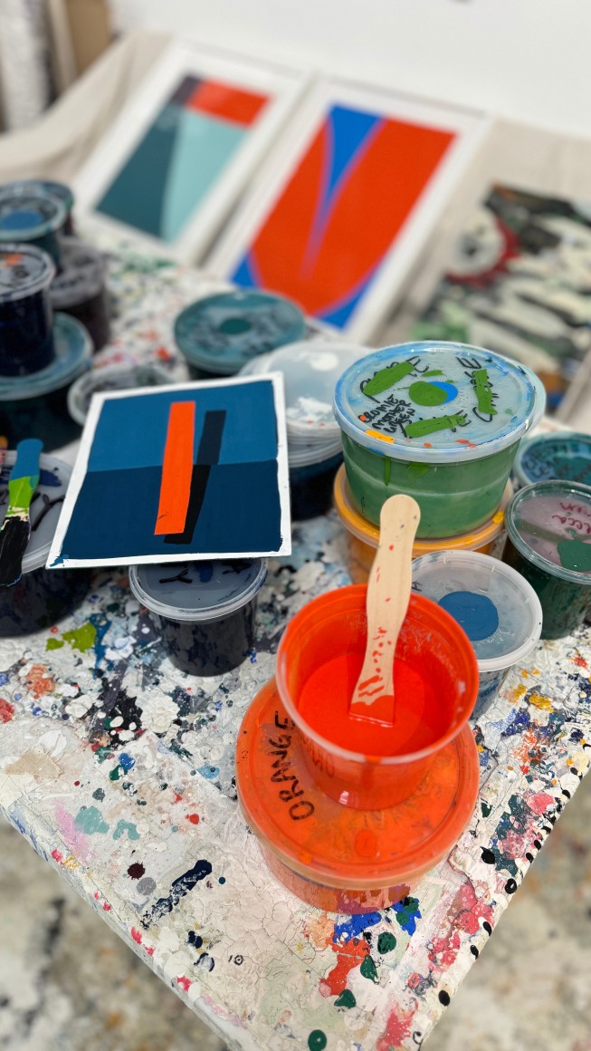
Paul Kremer's studio.
Paul Kremer's studio.
Paul Kremer's studio.
Paul Kremer's studio.
Paul Kremer's studio.
Paul Kremer's studio.
Paul Kremer's studio.
Paul Kremer's studio.
Paul Kremer's studio.
Paul Kremer's studio.
Paul Kremer's studio.
Paul Kremer's studio.
Paul Kremer's studio.
On the occasion of Straight Loops, Paul Kremer’s third solo exhibition at Berggruen Gallery, the artist sat down with us to discuss his philosophy on abstraction, the relationship between graphic design and fine art, and the creative process behind his work.
Berggruen Gallery: You use a variety of tools, from analog methods to artificial intelligence, to plan your paintings. Generally speaking, what does the process of making a painting look like for you?
Paul Kremer: Some artists like the process of mixing paint together on a canvas; I like the challenge of realizing my visions before I actually paint them. Usually, I have an idea while I'm falling asleep or waking up. I'll draw that idea (on paper or on a screen) and then start refining it. Sometimes forms appear that remind me of an object, an experience I’ve had, or a feeling I want to portray, and I adjust the drawing towards whatever ideas I’m having while I’m making art.
I like to further visualize my paintings by creating mockups in order to estimate scale. I’ll photoshop a painting idea into a room. This could be a room that I’ve taken a picture of or a found photo. I started doing this with Great Art in Ugly Rooms. However, a drawing might look great in a 2-inch mockup and fall flat when sizing it up to a 6-foot canvas. Color has the same issue. A 2-inch swatch of a color looks a lot different than a 6-foot sheet of that exact color. And trying to match the vibrancy of color on a screen to canvas is tough. The slightest color shift can affect the feeling of an entire painting. So all of that has to be changed or adjusted while I’m physically painting. I only use AI as a tool, not as an idea machine or a painting planner. For instance, I have used AI to help code programs that allow me to import and quickly re-arrange shapes that I’ve drawn and color palettes that I’ve created.
BG: While we were preparing for the exhibition, you wrote that you like “seeing the old with the new, ideas that cycle, and with each cycle or loop, creating something new.” Can you expand on the relationship between this cyclicity and geometric form?
PK: I make a lot of drawings, but only a few paintings. Then I move on. I’ll save groups of drawings in folders. I’ll pick and choose what feels right to paint at any specific moment. Later I'll go back to those drawings and see what I would like to update or change, and then work on variations of that series. I hope to create subtle differences, but within each loop learn something new.
I am also curious about repetition. When I listen to music, I might not like a song on the first listen, but after the 10th, I’m humming the melody. After the 100th listen, it's my favorite song.
There are also songs that you can’t deny liking on the first listen. It just hits you. The same thing happens when you make a drawing. Some you like right away; some grow on you. Usually, the images I loop back to are the ones that hit me right away.
BG: You ran a graphic design studio for twenty years before becoming an artist, working for clients like PBS and Lou Reed. What instigated the transition from design to painting, and what was it like? How do design and the commercial arts inform your practice as a fine artist now?
PK: I was lucky to work for some of my favorite artists and musicians. Even so, after 20 years, I realized my work life was only about promoting others, and I wanted to evolve. I love design; it seems obvious to me that design skills are tools that translate directly into painting. Plus, designers and artists alike – if we need to draw a distinction – know that what they do is more than making pretty pictures. They create personality and express emotion for things that can't be visualized in writing.
BG: Although the subject matter of the paintings is fairly diverse, plant forms, particularly florals, are a recurrent theme in Straight Loops. In your Mother series, you chose to incorporate flowers both for their formal similarity to eggs and their symbolic relation to maternity, but botanicals are also present in your Bloom, Exchange, and Set series—just to name a few. Why the draw to botanicals over other forms?
PK: Obsessions shift over time. There are other times when I am more obsessed with straight edges or geometric relationships, which I have also looped back to in this show; hence, the title Straight Loops. Nature creates all kinds of mind-blowing shapes and colors and is a constant source of curiosity for me.
That said, I didn't actually start out with botanicals in mind. This goes back to your earlier questions about cyclicity and the processes I use in painting. The Blooms, Exchanges, and Sets grew out of shapes that began when I was working on my last solo show with Berggruen Gallery, UV. The vaguely organic forms in paintings like Dive, Dock, and Flip and those in the Drift series morphed over time into lines for Voids and Mothers. Voids and Mothers created shapes that I re-arranged, flipped, and reversed, generating the outlines of what started to look like leaves, petals, or the wings of a bird or a butterfly.
So, why not botanicals? Aside from appreciating their intrinsic beauty, part of what I love about being an artist is the freedom to explore any subject matter. If that comes with the challenge of overcoming viewers’ notions about what might be too decorative or even cliche, then all the better. I might just start painting sunsets next.
I choose to appreciate and celebrate nature in all its forms while I’m alive. The search for beauty is profound. I feel lucky to be a small part of it and hope that comes through in my paintings.
BG: You co-founded the art collective I Love You Baby, working alongside other Houston-based artists in the nineties and 2000s. How was the nature of your artistic experimentation affected by those collaborative relationships, and how does it inform your solo practice now?
PK: I Love You Baby was an experiment in and of itself. Our group (and anyone who wanted to join us) painted together every Wednesday for 10 years, and I documented the whole thing. It proved that each of us as individual artists could be wildly different, but when we came together, we made art that had its own distinct personality. It doesn’t really inform my solo practice now, other than that I wish that I could make art that good.
BG: When we were preparing for the press release, you mentioned that in I Love You Baby, not only were artists allowed to paint over other artists’ work, but that it was mandated that you couldn’t be angry if another artist actually did paint over your work. This almost feels like a playful riff on Rauschenberg’s Erased de Kooning Drawing, itself an act of a collaboration, in that erasure (or covering) opens up new avenues for an artwork to blossom. You’re also doing this on a conceptual level in Straight Loops, by unmaking and remaking forms. Do you consider this transition from representational to abstracted representation to be an additive or subtractive process?
PK: Both. Each time I loop back to a series or a shape or line within a series, I want to make a variation that changes what I did previously, or even creates something totally new in the process. Sometimes I layer them; other times I add to, shrink, expand, combine, or delete from them. Ultimately, I want to learn from my paintings through time, and this process of change enables that.
BG: You’ve previously fielded comparisons to midcentury Color Field painters like Ellsworth Kelly, though I also see traces of other highly formal international artists in your work, such as Imi Knoebel or Zilia Sánchez. Do you find yourself aligning with any particular strain of art or design history, either from a formal or philosophical vantage?
PK: So many great artists have paved the road I’m walking. Some I learned about earlier in life and some only today (Zilia Sanchez). Leon Polk Smith, Helen Lundeberg and Lorser Feitelson, Marcia Hafif, and Yvonne Thomas -- all are aligned with me in some way, but I stumbled across them after many years of painting. What I love the most is that despite our different backgrounds, we all ended up on a similar path.
BG: One of the most alluring parts of these artworks is their vivacity, which is even more saturated than that of some Color Field artists. You mentioned that your color palette is not only fixed across your artworks, but also that it was gradually accrued over time. Can you speak a little bit more as to how you ultimately developed this palette? Is it still developing?
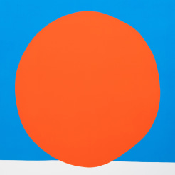
PK: I started painting as a challenge with one color, a vermillion, my favorite crayon red-orange, and also a color I loved in Francis Bacon paintings. I simply wanted to see how much I could do with that one color and expand from there. Through the years I’ve slowly added color into my loops. It’s a slow study in how colors react to one another.
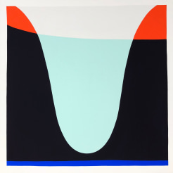
BG: A few of these artworks—particularly Arc 03 and Float 57—have this fascinating overlay of color which enhances the works’ geometric precision. Because they never blend, the colors almost look like gel filters for stage lighting laid on top of each other. What’s the process of laying out colors next to each other like, especially in this constrained palette?
PK: I wouldn’t say that my palette is constrained, even though I do loop back to certain favorite colors over and over again. It’s more that my palettes have developed slowly and methodically over time, using a recursive process that’s similar to the way in which I revisit shapes and forms. A blue-green that I have used in one painting to imply a shadow may emerge, slightly morphed from its original hue, as an object in the foreground of another painting. The colors work back and forth both in parallel, reverberating in a sense, as well as in gradations and variations.
I also love implying transparent overlays in my paintings, especially because my interpretations are wrong. In real life, a vermillion gel over a vibrant cyan blue causes a cool grayish brown-purple overlay. I like to change the hue of that overlay color until it feels much more like the color we might assume it would be, even if that color doesn’t accurately reflect what would occur in reality. Getting to the “right” “wrong” color can take a dizzying number of iterations, but I learn a lot about not only color, but also line, shape, and form along the way. Getting to the “right” “wrong” of a painting is equally important.
Paul Kremer (b. Chicago, 1971) uses traditional methods, working with acrylics on canvas or paper to achieve his distinctive style of painting. His artistic production oscillates between digitally printed meditations on the internet, and massive color field abstractions. Art in America's Raphael Rubinstein describes Kremer's work as "bold compositions whose hard-edge, single-color shapes (generally red-orange, black, or white) oscillate between flat abstraction and illusionistic geometry, evoking monumental architecture as well as broken-off glacier sections. New York-based art historian and curator Alex Bacon has written extensively on Kremer's work and has praised the artist's ability to combine abstraction with everyday familiarity: "Abstracting from familiar forms. . . enables Kremer to harness the sensations that arise from our day-to- day encounters." Kremer's work has also been referred to as "wonderfully freeing" and Kremer's use of overlapping color fields has been likened to "Josef Albers-style color interactions." Kremer’s paintings have been exhibited worldwide, including in solo and group shows in New York, Los Angeles, San Francisco, Miami, Paris, Turin and Brussels. Paul lives and works in Houston, Texas.
Paul Kremer: Straight Loops, March 7 – April 25, 2024. On view at 10 Hawthorne Street, San Francisco, CA 94105. Images and previews are available upon request. For all inquiries, please contact the gallery by phone (415) 781-4629 or by email info@berggruen.com.
All images courtesy of Paul Kremer.